강의 홍보
개요
캐글 데이터 연동
- 캐글 데이터를 구글 드라이브에 업로드 한 뒤 구글 코랩과 연동한다.
- Kaggle API를 통해 데이터를 불러올 수도 있지만, 수동으로 다운로드 받은 뒤 드라이브에 업로드 하였다.
# Mount Google Drive
from google.colab import drive # import drive from google colab

ROOT = "/content/drive"     # default location for the drive
print(ROOT)                 # print content of ROOT (Optional)
drive.mount(ROOT)           # we mount the google drive at /content/drive
/content/drive
Mounted at /content/drive
# import join used to join ROOT path and MY_GOOGLE_DRIVE_PATH
from os.path import join

# path to your project on Google Drive
MY_GOOGLE_DRIVE_PATH = 'My Drive/Colab Notebooks/competition/kaggle/2020 Kaggle Machine Learning'

PROJECT_PATH = join(ROOT, MY_GOOGLE_DRIVE_PATH)
print(PROJECT_PATH)
/content/drive/My Drive/Colab Notebooks/competition/kaggle/2020 Kaggle Machine Learning
/content/drive/My Drive/Colab Notebooks/competition/kaggle/2020 Kaggle Machine Learning
라이브러리 & 데이터 불러오기
import numpy as np
import pandas as pd
import matplotlib.pyplot as plt
import seaborn as sns

pd.set_option('mode.chained_assignment', None)
survey = pd.read_csv('./data/kaggle_survey_2020_responses.csv')
question = survey.iloc[0,:].T
full_df = survey.iloc[1:,:]
full_df.shape
/usr/local/lib/python3.6/dist-packages/IPython/core/interactiveshell.py:2718: DtypeWarning: Columns (0) have mixed types.Specify dtype option on import or set low_memory=False.
  interactivity=interactivity, compiler=compiler, result=result)


(20036, 355)
데이터 전처리
- 우선
India와 USA를 제외한 나라는 삭제하도록 한다. - 출력된 결과를 확인해보면 알겠지만, 행이 대폭 감소한 것을 확인할 수 있다.
full_df['Q3'].replace({'United States of America':'USA'}, inplace=True)
df1 = full_df[(full_df['Q3']=='India')|(full_df['Q3']=='USA')]
df1.reset_index(drop=True, inplace=True)
print(df1['Q3'].unique())
df1.shape
['USA' 'India']


(8088, 355)
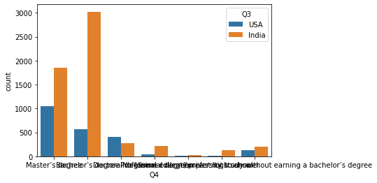
1차 데이터 시각화
- 이제 countplot()을 활용하여 시각화를 진행한다.
sns.countplot(x = 'Q4', hue = 'Q3', data = df1)
<matplotlib.axes._subplots.AxesSubplot at 0x7f3bbad50ac8>