I. 개요
- NLP(Natural Language Processing): 기계가 인간의 언어를 이해하고 해석하는 데 중점
- 활용예제: 기계 번역, 챗봇, 질의응답 시스템 (딥러닝)
- Text Analysis: 비정형 텍스트에서 의미 있는 정보를 추출하는 것에 중점
- 활용예제: 비즈니스 인텔리전스, 예측분석 (머신러닝)
- 텍스트 분석의 예
- 텍스트 분류: 문서가 특정 분류 또는 카테고리에 속하는 것을 예측하는 기법
- 감성 분석: 텍스트에서 나타나는 감정/판단/믿음/의견 등의 주관적인 요소 분석하는 기법
- 텍스트 요약: 텍스트 내에서의 중요한 주제나 중심 사상 추출(Topic Modeling)
- 텍스트 군집화(Clustering)와 유사도 측정: 비슷한 유형의 문서에 대해 군집화를 수행하는 기법. 텍스트 분류를 비지도학습으로 수행하는 방법
II. 텍스트 분석 개요
- 텍스트를 의미있는 숫자로 표현하는 것이 핵심
- 영어 키워드: Feature Vectorization 또는 Feature Extraction.
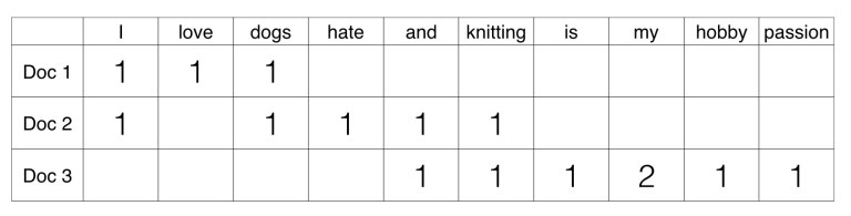
- 텍스트를 Feature Vectorization에는 BOW(Bag of Words)와 Word2Vec 두가지 방법이 존재.
- 머신러닝을 수행하기 전에 반드시 선행되어야 함.
(1) 텍스트 분석 수행 방법
- 1단계: 데이터 전처리 수행. 클렌징, 대/소문자 변경, 특수문자 삭제. 단어 등의 토큰화 작업, 의미 없는 단어(Stop word) 제거 작업, 어근 추출(Stemming/Lemmdatization)등의 텍스트 정규화 작업 필요
- 2단계: 피처 벡터화/추출: 가공된 텍스트에서 피처 추출 및 벡터 값 할당.
- Bag of Words: Count 기반 or TF-IDF 기반 벡터화
- 3단계: ML 모델 수립 및 학습/예측/평가를 수행.
(2) 파이썬 기반의 NLP, 텍스트 분석 패키지
NTLK: 파이썬의 가장 대표적인 NLP 패키지. 방대한 데이터 세트와 서브 모듈 보유. 그러나, 속도가 느리다는 단점 존재- ‘Gensim’: 토픽 모델링 분야에서 주로 사용되는 패키지. Word2Vec 구현도 가능
SpaCY: 최근 가장 주목을 받는 NLP 패키지.
III. 텍스트 전처리 - 정규화
- 텍스트 자체를 바로 피처로 만들 수는 없다. 텍스트를 가공하기 위한 클렌징, 토큰화, 어근화 등이 필요.
- 정규화 작업의 종류는 다음과 같음
- 클렌징: 불필요한 문자,기호 등을 사전제거 (정규표현식 주로 활용)
- 토큰화
- 필터링/스톱 워드 제거/철자 수정
- Stemming
- Lemmatization
(1) 문장 토큰화
- 문장 토큰화(sentence tokenization)는 문장의 마침표, 개행문자(\n) 등 문장의 마지막을 뜻하는 기호에 따라 분리하는 것이 일반적임
- 아래 샘플코드는 문장 토큰화에 관한 것임
punkt는 마침표, 개행 문자 등의 데이터 세트를 다운로드 받는다.
from nltk import sent_tokenize
import nltk

nltk.download("punkt")
[nltk_data] Downloading package punkt to /root/nltk_data...
[nltk_data]   Unzipping tokenizers/punkt.zip.


True
text_sample = "The Matrix is everywhere its all around us, here even in this wroom. \
               You can see it out your window or on your television. \
               You feel it when you go to work, or go to church or pay your taxes."

sentences = sent_tokenize(text = text_sample)
print(type(sentences), len(sentences))
print(sentences)
<class 'list'> 3
['The Matrix is everywhere its all around us, here even in this wroom.', 'You can see it out your window or on your television.', 'You feel it when you go to work, or go to church or pay your taxes.']
- 위 코드에서 확인할 수 있는 것은
sent_tokenize가 반환하는 것은 각각의 문장으로 구성된 list 객체이며, 이 객체는 3개의 문장으로 된 문자열을 가지고 있음을 알 수 있다.
(2) 단어 토큰화
- 단어 토큰화(Word Tokenization)는 문장을 단어로 토큰화하는 것을 말하며, 기본적으로 공백, 콤마(,), 마침표(.), 개행문자 등으로 단어를 분리하지만, 정규 표현식을 이용해 다양한 유형으로 토큰화를 수행할 수 있다.
- 단어의 순서가 중요하지 않은 경우에는 Bag of Word를 사용해도 된다.
- 이제 코드를 구현해본다.
from nltk import word_tokenize

sentence = "The Matrix is everywhere its all around us, here even in this room."
words = word_tokenize(sentence)
print(type(words), len(words))
print(words)
<class 'list'> 15
['The', 'Matrix', 'is', 'everywhere', 'its', 'all', 'around', 'us', ',', 'here', 'even', 'in', 'this', 'room', '.']
- 이번에는 문장 및 단어 토큰화를 함수로 구현해보도록 한다.
- 우선, 문장별로 토큰을 분리한 후
- 분리된 문장별 단어를 토큰화로 진행하는 코드를 구현한다 (for loop 활용)
from nltk import word_tokenize, sent_tokenize

# 여러 개의 문장으로 된 입력 데이터를 문장별로 단어 토큰화하게 만드는 함수
def tokenize_text(text):

  # 문장별로 분리 토큰
  sentences = sent_tokenize(text)

  # 분리된 문장별 단어 토큰화
  word_tokens = [word_tokenize(sentence) for sentence in sentences]
  return word_tokens

# 여러 문장에 대해 문장별 단어 토큰화 수행
word_tokens = tokenize_text(text_sample)
print(type(word_tokens), len(word_tokens))
print(word_tokens)
<class 'list'> 3
[['The', 'Matrix', 'is', 'everywhere', 'its', 'all', 'around', 'us', ',', 'here', 'even', 'in', 'this', 'wroom', '.'], ['You', 'can', 'see', 'it', 'out', 'your', 'window', 'or', 'on', 'your', 'television', '.'], ['You', 'feel', 'it', 'when', 'you', 'go', 'to', 'work', ',', 'or', 'go', 'to', 'church', 'or', 'pay', 'your', 'taxes', '.']]
- 각각의 개별 리스트는 해당 문장에 대한 토큰화된 단어를 요소로 가진다.
- 문장을 단어별로 하나씩 토큰화 할 경우 문맥적인 의미는 무시될 수 밖에 없는데.. 이러한 문제를 해결하기 위해 도입된 개념이 n-gram이다.
N-gram은 연속된 N개의 단어를 하나의 토큰화 단위로 분리해 내는 것.- 예시) I Love You
- (I, Love), (Love, You)
IV. 텍스트 전처리 - 스톱 워드(불용어) 제거
- 의미가 없는
be동사 등을 제거 할 때 사용함- 이런 단어들은 매우 자주 나타나는 특징이 있음
NTLK의 스톱 워드에 기본적인 세팅이 저장되어 있음
import nltk
nltk.download("stopwords")
[nltk_data] Downloading package stopwords to /root/nltk_data...
[nltk_data]   Unzipping corpora/stopwords.zip.


True
- 총 몇개의
stopwords가 있는지 알아보고, 그중 20개만 확인해본다.
print("영어 stop words 개수:", len(nltk.corpus.stopwords.words("english")))
print(nltk.corpus.stopwords.words("english")[:20])
영어 stop words 개수: 179
['i', 'me', 'my', 'myself', 'we', 'our', 'ours', 'ourselves', 'you', "you're", "you've", "you'll", "you'd", 'your', 'yours', 'yourself', 'yourselves', 'he', 'him', 'his']
- 이번에는
stopwords를 필터링으로 제거하여 분석을 위한 의미 있는 단어만 추출하도록 함.
import nltk
stopwords = nltk.corpus.stopwords.words("english")
all_tokens = []

# 위 예제에서 3개의 문장별로 얻은 word_tokens list에 대해 불용어 제거하는 반복문 작성
for sentence in word_tokens:
  filtered_words = [] # 빈 리스트 생성

  # 개별 문장별로 토큰화된 문장 list에 대해 스톱 워드 제거
  for word in sentence:

    # 소문자로 모두 변환
    word = word.lower()

    # 토큰화된 개별 단어가 스톱 워드의 단어에 포함되지 않으면 word_tokens에 추가
    if word not in stopwords:
      filtered_words.append(word)
  all_tokens.append(filtered_words)

print(all_tokens)
[['matrix', 'everywhere', 'around', 'us', ',', 'even', 'wroom', '.'], ['see', 'window', 'television', '.'], ['feel', 'go', 'work', ',', 'go', 'church', 'pay', 'taxes', '.']]
is, this와 같은 불용어가 처리된 것 확인됨
V. 텍스트 전처리 - 어간(Stemming) 및 표제어(Lemmatization)
- 동사의 변화
- 어근 및 표제어는 단어의 원형을 찾는 것.
- 그런데, 표제어 추출(Lemmatization)이 어근(Stemming)보다는 보다 더 의미론적인 기반에서 단어의 원형을 찾는다.
(1) 어간(Stemming)
Stemming은 원형 단어로 변환 시, 어미를 제거하는 방식을 사용한다.- 예)
worked에서 ed를 제거하는 방식을 사용
Stemming기법에는 크게 Porter, Lancaster, Snowball Stemmer가 있음.- 소스코드 예시는 아래와 같음
from nltk.stem import PorterStemmer
from nltk.stem import LancasterStemmer
porter = PorterStemmer()
lancaster = LancasterStemmer()

word_list = ["friend", "friendship", "friends", "friendships","stabil","destabilize","misunderstanding","railroad","moonlight","football"]
print("{0:20}{1:20}{2:20}".format("Word","Porter Stemmer","lancaster Stemmer"))
for word in word_list:
    print("{0:20}{1:20}{2:20}".format(word,porter.stem(word),lancaster.stem(word)))
Word                Porter Stemmer      lancaster Stemmer
friend              friend              friend
friendship          friendship          friend
friends             friend              friend
friendships         friendship          friend
stabil              stabil              stabl
destabilize         destabil            dest
misunderstanding    misunderstand       misunderstand
railroad            railroad            railroad
moonlight           moonlight           moonlight
football            footbal             footbal
- LancasterStemmer 간단하지만, 가끔 지나치게 over-stemming을 하는 경향이 있다. 이는 문맥적으로는 큰 의미가 없을수도 있기 때문에 주의를 요망한다.
print("For Lancaster:", lancaster.stem("destabilized"))
print("For Porter:", porter.stem("destabilized"))
For Lancaster: dest
For Porter: destabil
- 위와 같이
destabilized(불안정한) 뜻을 가진 단어가 destabil(불안정)이 아닌 dest(목적지)로 변환되기도 한다.
(2) 표제어 추출(Lemmatization)
- 표제어 추출은 품사와 같은 문법적인 요소와 더 의미적인 부분을 감안하여 정확한 철자로 된 어근 단어를 찾아준다.
- 어근을 보통
Lemma라고 부르며, 이 때의 어근은 Canoical Form, Dictionary Form, Citation Form 이라고 부른다. - 간단하게 예를 들면,
loves, loving, loved는 모두 love에서 파생된 것이며, 이 때 love는 Lemma라고 부른다.
from nltk.stem import WordNetLemmatizer
import nltk
nltk.download('wordnet')
[nltk_data] Downloading package wordnet to /root/nltk_data...
[nltk_data]   Package wordnet is already up-to-date!


True
lemma = WordNetLemmatizer()
print(lemma.lemmatize('amusing', 'v'), lemma.lemmatize('amuses', 'v'), lemma.lemmatize('amused', 'v'))
print(lemma.lemmatize('happier', 'v'), lemma.lemmatize('happiest', 'v'))
print(lemma.lemmatize('fancier', 'a'), lemma.lemmatize('fanciest', 'a'))
amuse amuse amuse
happier happiest
fancy fancy
- 이번에는 조금 긴 문장을 활용하여 작성하도록 한다.
import nltk
from nltk.stem import WordNetLemmatizer
wordnet_lemmatizer = WordNetLemmatizer()

sentence = "He was running and eating at same time. He has bad habit of swimming after playing long hours in the Sun."
punctuations="?:!.,;" # 해당되는 부호는 제외하는 코드를 만든다.
sentence_words = nltk.word_tokenize(sentence)
for word in sentence_words:
    if word in punctuations:
        sentence_words.remove(word)

sentence_words
print("{0:20}{1:20}".format("Word","Lemma"))
for word in sentence_words:
    print ("{0:20}{1:20}".format(word,wordnet_lemmatizer.lemmatize(word)))
Word                Lemma
He                  He
was                 wa
running             running
and                 and
eating              eating
at                  at
same                same
time                time
He                  He
has                 ha
bad                 bad
habit               habit
of                  of
swimming            swimming
after               after
playing             playing
long                long
hours               hour
in                  in
the                 the
Sun                 Sun
- 지금까지 진행한 것은 텍스트 전처리의 일환으로 활용한 것이다. 각각의 정규화, 불용어, 어간 및 표제어 등은 각각 함수로 작성하는 것을 권한다.
VI. Reference