Programming

Heroku를 활용한 배포 - DB 연결편

읽기 전 공지

  • 본 글은 2022년 11월 28일까지만 유효합니다. 무료 버전이 사라지기 때문에, 앞으로 어떻게 될지는 현재 글 쓰는 시점에서는 모릅니다. 이 부분에 주의해서 참고 하시기를 바랍니다.

강의 홍보

Docker Installation in Windows

사전 준비

도커 설치

Untitled

  • 관리자 권한으로 실행

Untitled

  • 설치가 완료가 되면 Close and Log Out 버튼이 나오면 클릭하면 윈도우 로그아웃이 진행되기 때문에, 다시 재 로그인을 하도록 한다.
  • 아래 그림 메뉴 우측 상단에 Sign In 버튼을 클릭해 로그인을 한다.

Untitled

  • 도커 Settings 창에 들어가서 아래 그림처럼 변경후 Apply & Restart 버튼을 클릭한다.

Untitled

테스트

  • PowerShell에서 도커 명령어가 실행되는지 확인한다.
PS C:\Users\h> docker ps
CONTAINER ID   IMAGE     COMMAND   CREATED   STATUS    PORTS     NAMES
PS C:\Users\h> docker --version
Docker version 20.10.20, build 9fdeb9c
PS C:\Users\h> wsl -l -v
  NAME                   STATE           VERSION
* Ubuntu                 Running         2
  docker-desktop         Running         2
  docker-desktop-data    Running         2

WSL2 설치 윈도우 10

Step 0. 설정을 통해 Hyper-V 역할 활성화

  • Windows 기능 사용/사용 안 함

Untitled

  • 재부팅을 해야 한다.

Step 1. WSL2 설치 과정

  • Windows PowerShell 관리자로 실행 후 다음 명령어 입력
$ dism.exe /online /enable-feature /featurename:Microsoft-Windows-Subsystem-Linux /all /norestart
$ dism.exe /online /enable-feature /featurename:VirtualMachinePlatform /all /norestart

Untitled

  • Windows Powershell 열고 아래 코드 실행
$ wsl --set-default-version 2
WSL 2와의 주요 차이점에 대한 자세한 내용은 https://aka.ms/wsl2를 참조하세요

마이크로소프트 스토어에서 리눅스 설치

  • 마이크로소프트 스토어(Microsoft Store) 앱을 열고 Ubuntu를 검색한다.

Untitled

Excel with MySQL 연동

개요

  • 엑셀 VBA 강의 중 Excel에서 MySQL DB와 연동하는 방법 의뢰를 받음
  • 엑셀은 MySQL과 연결이 (생각보다) 매우 쉽게 할 수 있도록 설계 되어 있었음

사전준비

버전 확인

  • 먼저 필자는 윈도우 11에서 작업중임
  • 필자의 엑셀 정보는 아래와 같음
    • [계정] - [Excel 정보] 클릭하면 아래와 같음

Untitled

  • 필자의 MySQL 정보는 아래와 같음

Untitled

필수 설치 프로그램 다운로드 및 설치

Untitled

Plotly 그래프 - 막대 그래프 색상 변경

개요

  • 특정 컬럼의 색상을 변경하는 코드를 작성한다.

기본 그래프 작성

  • 우선 아래와 같은 기본 그래프를 작성한다.
import plotly.express as px 

tips = px.data.tips()
tips_mean_day = tips.groupby("day").mean().reset_index()
tips_mean_day.head()

Untitled

fig = px.bar(tips_mean_day, x = 'day', y = 'tip')
fig.show()

newplot_01.png

Sun 색상 변경

  • Sun 값의 막대 그래프의 색상을 변경하도록 한다.
  • 먼저 marker.color를 활용하여 색상을 먼저 지정한 뒤, X축 라벨의 순서를 후에 재정렬한 것이다.
fig.data[0].marker.color = ['#ff0000', '#ff0000', 'black', '#ff0000']
fig.layout.xaxis.categoryarray = ["Thur", "Fri", "Sat", "Sun"]
fig.show()

newplot_01.png

투명도 설정

fig.data[0].marker.color = ['#ff0000', '#ff0000', 'black', '#ff0000']
fig.data[0].marker.opacity = [0.3, 0.3, 1, 0.3]
fig.layout.xaxis.categoryarray = ["Thur", "Fri", "Sat", "Sun"]
fig.show()

newplot_02.png

Plotly 그래프 - 막대 그래프 X축 라벨 변경하기

개요

  • 기존에 작성한 그래프를 목적에 맞게 수정 및 변경할 수 있다.
  • Figure Object를 활용한다.

데이터 불러오기 및 가공

  • tips 데이터를 불러온 뒤, 데이터를 가공하여 평균 값을 구한다.
import plotly.express as px 

tips = px.data.tips()
tips_mean_day = tips.groupby("day").mean().reset_index()
tips_mean_day.head()

Untitled

막대 그래프 작성하기

  • 기본 막대그래프를 작성한다.
  • 그런데, X축의 값을 보면 요일별로 정리가 안된 것을 확인할 수 있다. 이 부분을 수정하도록 한다.
fig = px.bar(tips_mean_day, x = 'day', y = 'tip')
fig.show()

newplot_01.png

막대 그래프의 X 라벨 변경하기

  • 우선 막대그래프의 순서를 변경하도록 한다. 세가지 방법이 있다. 첫번째는 최초 그래프를 생성할 때, category_orders 에 그래프의 순서를 지정하는 방법이 있다.
fig = px.bar(tips_mean_day, x = 'day', y = 'tip', category_orders={"day": ["Thur", "Fri", "Sat", "Sun"]})
fig.show()

newplot_02.png

Plotly 그래프 - Plotly Express

개요

  • High-Level API 형태인 Plotly Express에 대해 학습하도록 한다.
  • Plotly Express는 간단하게 말하면 Pandas Dataframe과 직접적으로 연동이 가능하다.
  • 보다 직관적으로 그래프를 시각화할 수 있기 때문에 초기 밑그림을 그릴 때는 Plotly Express로 작성하는 것이 좋다.
  • 전체 설명 참고자료 : Plotly Express in Python

Plotly Express 요약

Plotly Express 그래프 종류

Plotly Express currently includes the following functions:

Plotly 그래프 - 테마 변경하기

개요

  • plotly 그래프의 테마를 변경하는 방법에 대해 알아본다.

그래프 테마의 종류 확인하기

  • 우선 기본 그래프를 확인한다.
import plotly.graph_objects as go
weekly_sales = dict({
    "data": [{
        "type": "bar", 
        "x": ["Monday", "Tuesday", "Wednesday", "Thursday", "Friday", "Saturday", "Sunday"], 
        "y": [28, 27, 25, 31, 32, 35, 36]
    }], 
    "layout" : {"title": {"text": "Sales of the week", 
                          "x": 0.5, "font": {"color": "red", "size": 15}}}
})

fig = go.Figure(weekly_sales)
fig.show()

newplot.png

  • 그래프 테마를 변경하기 위해 우선 종류를 확인해야 한다.
plotly.io.templates
Templates configuration
-----------------------
    Default template: 'plotly'
    Available templates:
        ['ggplot2', 'seaborn', 'simple_white', 'plotly',
         'plotly_white', 'plotly_dark', 'presentation', 'xgridoff',
         'ygridoff', 'gridon', 'none']

그래프 테마 변경하기

  • 그래프 테마를 변경하도록 하기 위해서는 간단하게 아래와 같이 적용하면 된다.
fig.layout.template = 'ggplot2'
fig.show()

newplot_02.png

Plotly 그래프 - 이미지 내보내기

개요

  • Plotly 그래프를 다양한 방법으로 내보내는 코드를 작성해본다.
  • 본 블로그에서는 HTML, PNG 두가지 형태로 내보내는 방법을 숙지한다.
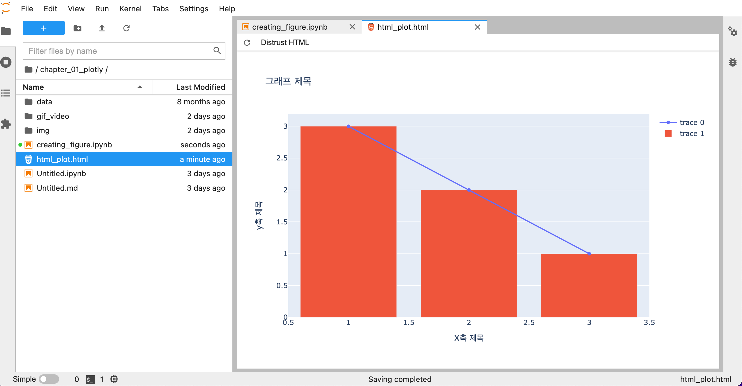
HTML로 내보내기

  • plotly figures는 HTML 및 자바스크립트로 구성되어 있다.
  • 소스코드는 아래와 같다.
fig.write_html('html_plot.html', config={'toImageButtonOptions':{'format': 'svg'}})
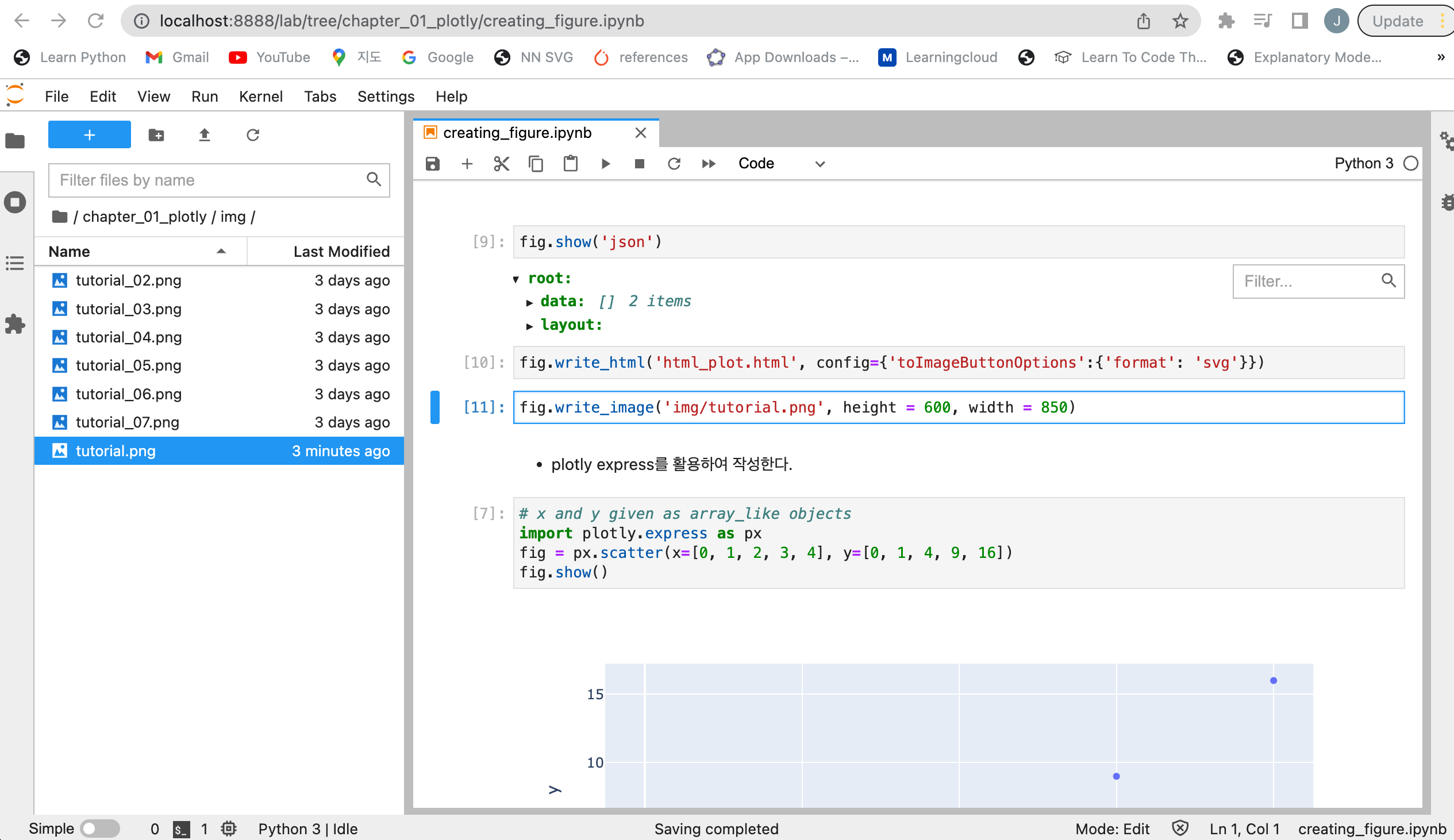
Screen Shot 2022-09-11 at 4.00.12 PM.png

image로 내보내기

  • 이미지로 내보내기 위해서는 아래와 같이 소스코드를 작성한다.
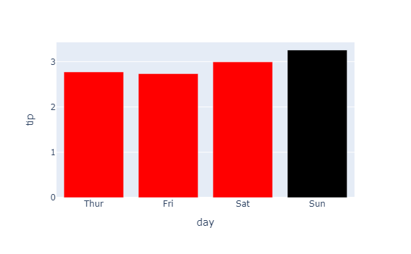
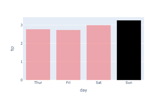
fig.write_image('path/to/image_file.svg',height=600, width=850)
  • 그런데, 실행 시, 다음과 에러가 나올 경우 아래와 같이 라이브러리를 설치한다.
---------------------------------------------------------------------------
ValueError                                Traceback (most recent call last)
<ipython-input-11-691564193a43> in <module>
----> 1 fig.write_image('img/tutorial.png', height = 600, width = 850)

/Library/Frameworks/Python.framework/Versions/3.8/lib/python3.8/site-packages/plotly/basedatatypes.py in write_image(self, *args, **kwargs)
   3819         import plotly.io as pio
   3820 
-> 3821         return pio.write_image(self, *args, **kwargs)
   3822 
   3823     # Static helpers

/Library/Frameworks/Python.framework/Versions/3.8/lib/python3.8/site-packages/plotly/io/_kaleido.py in write_image(fig, file, format, scale, width, height, validate, engine)
    266     # -------------
    267     # Do this first so we don't create a file if image conversion fails
--> 268     img_data = to_image(
    269         fig,
    270         format=format,

/Library/Frameworks/Python.framework/Versions/3.8/lib/python3.8/site-packages/plotly/io/_kaleido.py in to_image(fig, format, width, height, scale, validate, engine)
    132     # Raise informative error message if Kaleido is not installed
    133     if scope is None:
--> 134         raise ValueError(
    135             """
    136 Image export using the "kaleido" engine requires the kaleido package,

ValueError: 
Image export using the "kaleido" engine requires the kaleido package,
which can be installed using pip:
    $ pip install -U kaleido
pip install -U kaleido
  • 다음 코드를 재 실행한다.
fig.write_image('img/tutorial.png', height = 600, width = 850)
  • 해당되는 경로에서 실제 이미지가 내보내기가 되었는지 확인한다.

Screen Shot 2022-09-11 at 4.18.57 PM.png

Plotly 그래프 - Figure Object 이해하기

Figure Object

  • Figure Object는 크게 두가지로 구성(Attribute)이 되어 있다.
    • data : 여기에서는 그래프와 관련된 각종 정보가 담긴 데이터를 의미한다. 예를 들면, 산점도를 그린다면, X와 Y값의 정보를 확인할 수 있다. 그래프의 색상도 정의할 수 있다.
    • layout : data외의 모든 것은 layout에 속한다. 기본적으로 layout은 그래프의 Styling 요소들이 들어 있다. 예를 들면, X축, Y축의 제목, 색상 등을 변경하고자 할 때는 layout에 접근해야 한다.
  • 간단하게 Figure Object를 정의해본다.
import plotly.graph_objects as go

fig = go.Figure()
fig.show()

tutorial_02.png